Creating rare, handcrafted letterpress books at Pegana Press since 2009.

Poseidonis Cycle - The Age of Whelming
Tales of Poseidonis-Deluxe letterpress edition laid out in the dimensions of the golden rectangle.
Seen through the prism of Space and Time. Tales of the Ending of the great Isle of Poseidonis, woven in colors and words by Clark Ashton Smith.
This rare collector’s edition contains the following:
Tolometh
The Double Shadow
A Voyage to Sfanomoë
Atlantis - A Poem
With a new introduction by the last of the Romantic poets Donald Sidney-Fryer
Strictly limited to 80 numbered copies.
The Age of Whelming is hand set letterpress printed on Hahnemühle laid paper and hand bound on site - cloth on boards - with letterpress spine titles and ornate letterpress front cover title, in the dimensions of the Golden Rectangle. Hand made Papyrus Endpapers from Nepal.
ORDER NOW TO RESERVE FROM THE BINDERY
But now, within my sunken walls,
the slow blind ocean-serpent crawls,
and sea-worms are my ministers,
and wandering fishes pass me now
or press before mine eyeless brow
as once the thronging worshippers...
Illustrations by Justine Jones
We are excited to announce that Justine Jones has been commissioned to illustrate this edition. Justine has a real talent for bringing Clark Ashton Smith’s characters and scenes to life in her artwork.
Pictured above is her illustration of Avyctes from The Double Shadow which appears in this book.
She did the frontispiece for our publication of Zothique Prism II-The Garden of Adompha, and we are delighted that she has made time to help us bring The Age of Whelming to life.
You can see more of Justine’s work on her website.
Poseidonis Cycle-The Age of Whelming $580
The Tomb-Spawn A Tale of Zothique

The Tomb-Spawn
The grotesque workings of Fate are manifest in this frightening tale of age-old horror...
Frontispiece by British Fantasy Award winner Jim Pitts
...And this alone is certain, that somewhere still, in the sealed tomb, the alien monster abides in death, together with King Ossaru...
Limited to 55 numbered copies
Letterpress printed with hand-set Goudy Franciscan type and printed on Hahnemuhle Ingres Antique watermarked paper. Sewn into light blue French covers with royal blue thread as a chapbook.
The Tomb-Spawn $220 SALE $150
The Weird of Avoosl Wuthoqquan
Letterpress Chapbook
Numbered Limited Edition
Letterpress Chapbook

A grotesquely dark and humorous story from the master of the Bizarre.
Hand-sewn into forest-green heavy French Canson paper covers as a chapbook.
Hand-Set Type
Numbered Limited Edition
Letterpress Chapbook

Letterpress printed with hand-set type on snowy-white Hahnemuhle Ingres watermarked paper from Germany.
Numbered Limited Edition
Numbered Limited Edition

Strictly limited to 80 numbered copies.
...Avoosl Wuthoqquan sorted out the gems in gleaming rows and circles, as he had done so many times before; and he set apart all the emeralds with his new acquisitions at one end, like captains leading a file. He was well pleased with his bargain, well satisfied with his overflowing caskets. He regarded the jewels with an avaricious love, a miserly complacence; and one might have thought that his eyes were little beads of jasper, set in his leathery face as in the smoky parchment cover of some olden book of doubtful magic. Money and precious gems—these things alone, he thought, were immutable and non-volatile in a world of never-ceasing change and fugacity.
Robert H. Knox Illustration
Robert H. Knox Illustration

Artist, best known for Necronomicon Press, Crypt of Cthulhu, Hippocampus Press, et al.. Specialties are Dark Fantasy/Horror and humor.
"Ink, oil, acrylic and sculpture are my media of choice".
Robert H. Knox Illustration

The Weird of Avoosl Wuthoqquan $220 SALE $150
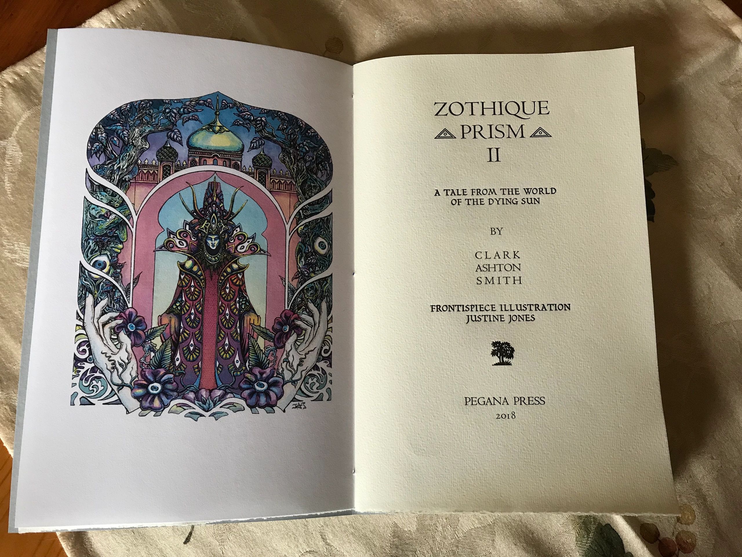
Zothique Prism II 3 COPIES LEFT
The Garden of Adompha. Letterpress chapbook illustrated by Justine Jones. Pegana Press 2018
A tale of wickedness and decadence from the world of the Dying Sun. Presented in a fine press edition chapbook uniform with Zothique Prism I. And with newly commissioned color frontispiece illustration by Justine Jones.
Letterpress printed on Hahnemühle Ingres watermarked edition paper, hand sewn onto heavy French covers with ornate titling.
18 pages.
Strictly limited to 55 hand numbered copies.
The Garden of Adompha. Frontispiece by Justine Jones.
Pegana Press 2018
Chapbook
Zothique Prism II $280

Averoigne Broadside
Enter the prismatic realm of Averoigne
The Enchantress weaves her spells and the World of Averoigne becomes alive. The fabulous Jim Piits creates a surreal tryptych of the Enchantress flanked by carven satyrs.
Printed on pale blue heavy French Canson paper using Dutch reflex blue ink. Letterpress printed with vintage Goudy typefaces. Limited to 61 numbered copies.
8 inches by 15 inches (approximately); suitable for framing.
please note, broadsides cannot be shipped media mail, but when purchase with books or chapbooks, media mail rates apply.
$75
Illustrated by Jim Pitts
Averoigne Broadside $75

Zothique Broadside
Pegana Press 2017 $45.00
Zothique by Clark Ashton Smith. A poem from the World of the Dying Sun Originally published in Dark Chateau, Arkham House. Letterpress Broadside suitable for framing.
Letterpress printed on thick cotton archival paper using Goudy and Civilite types in 2 color with Dutch Blue and Black inks. Shipped flat in an archival sleeve. Dimensions are 7” x 15”. Limited to 55 hand numbered copies.
Please note, broadsides cannot be shipped media mail, but when purchased with books or chapbooks, media mail rates will apply.
Zothique Broadside $45.00
Crafting The Age of Malygris: Design and Intent
April 10, 2014
Posted by Mike Tortorello
Here is some background on what went into the making of The Age Of Malygris from a printers perspective.
The font used for the body of the text is Optima, designed by Hermann Zapf for a german foundry in the early 1950's. I chose it because it's cool, detached feel seemed to lend itself to Clark's dispassionate glimpses of a remote age. I think it also allows the ornateness and beauty of the prose to be the focus. When designing the book, I pictured a scribe or monk slowly transferring the text of a crumbling tome that may have come from the chamber of Malygris. The paper is german watermarked with the feel and look of parchment; Hahnemühle has been making this kind of paper for over 400 years. I really wanted the book to feel OLD. Keeping the craft of true bookmaking alive to pass on is valuable to me as well. The type is distributed(put away) after the print run and will never be done again. It takes about 4 months of painstaking work to create books like this but worth the effort. It also gave me the chance to speak and work with Donald Sidney-Fryer which was incredible.
I too have these stories in my library in several versions; Arkham House, Weird Tales, Ballantine, etc. Other than the late Roy Squires beautiful chapbooks, none of the CAS books were made to truly enhance and convey Clark's work. Their materials and manufacturing were based on cost; and designs were based on standardization.
Don't get me wrong, I love all those versions, but as a CAS lover I would always want a beautiful edition in my collection and I thought it was time to create one.
The inclusion of Clark's original illustrations and DSF's prelude, as well as a poem not published since The Dark Chateau become the setting for the jewellike prose he left for us.
I plan on finishing the Posedionis stories in Cycle II after doing a new Dunsany and then probably the Zothique stories.
The Age of Malygris - Poetry, Prose, and Sacred Geometry
Collectors Corner
The following section contains posts from our blog written Spring of 2014 for our release of Poseidonis Cycle - The Age of Malygris. With the forthcoming release of a brand new Poseidonis Cycle, we felt that these posts were still relevant. We hope you enjoy reading them.
From Pegana Press Blog 2014
A Review of Poseidonis - The Age of Malygris (Pegana Press 2014) on Michael Swanwick's Blog, Flogging Babel, titled Books from Lost Poseidonis
Clark Ashton Smith Poseidonis Cycle - The Age of Malygris
March 25, 2014
Mike and Rita of Pegana Press are excited to begin offering The Age Of Malygris on the website. This collection was inspired by Clark Ashton Smith's stories of the Magian Malygris. It includes two illustrations by the author and a forward by the exquisite Donald Sidney-Fryer.
Made with love and care at Pegana Press, this book was type set, letter press printed and bound all by hand. The dimensions of the book are based on the sacred geometry of the golden rectangle, and for the story titles we used Civilite type, one of the earliest cursive fonts designed. For the end papers we used Lokta paper, hand made in Nepal from two varieties of Daphne, one of which is Daphne papyracea, which gives the book a feeling of antiquity.
It is the mission of Pegana Press to offer the multi-sensory experience of reading some of the best authors of the fantasy genre presented in an artisan crafted book. May it meet with your approval.
We invite you to view more pictures of the book on our website and we welcome feedback.
We'll leave you with a quote.
...Perhaps we will not return, but will follow the tropic summer from isle to halcyon isle, across the amaranthine seas of myth and fable...
--Clark Ashton Smith
Customer Reviews
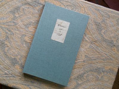
A Truly Beautiful Volume...
This to-be even rarer CAS edition harkens back to the earliest collections of Smith's work, both those printed at the author's expense and those scarce editions compiled by those similarly swept away by the genius (loci) of this master wordsmith.
In construction, "The Age of of Malygris" is reminiscent of the Book Club of San Francisco's 1943 edition of "Odes and Sonnets" and the Philopolis Press 1912 edition of "The Star Treader and Other Poems."
The design of "The Age of Malygris" incorporates the Golden Rectangle, a mathematical ratio that has fascinated men of art and science since Pythagorus (6th century BCE), the rectangle considered the most aesthetically pleasing; and this little volume is truly a delight to the eye even before one dips into its exquisite contents.
Donald Sidney-Fryer, CAS historian/bibliographer ("The Emperor of Dreams", Donald M Grant, 1978) and gifted poet in his own right ("Songs and Sonnets Atlantean", Arkham House, 1971) aptly provides the introduction to Smith as fellow poet and priest of Atlantis.
The tales and poetry, of course, are still replete with the magic that acolytes of Smith have long-loved and, even after 80 years, still inspire awe and wonder.
--R. Finegold, USA
I could not resist this book's siren call...
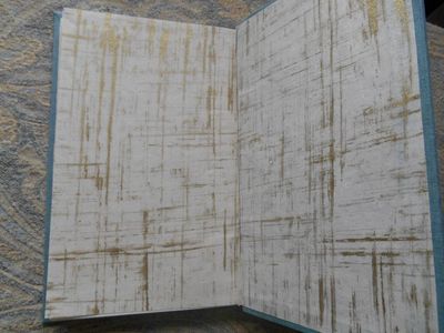
We can only consider such a realization as an enthusiastic revival of ancient private press. The project has kept its promises and intentions delight by its consistency. I must say that I could not resist to this book's siren call. I enjoy laid paper. Hahnemühle was the best choice. Optima font suits perfectly on it. The Lokta paper that adorns the limits (I mean inside covers) of the volume intensifies the refinement and offers a vegetal embellishment, something essential in Smith’s mind. The great bottom and right margins enable to hold the book in a pleasant way and give a leisurely reading. It’s also nice for our annoying hands as we usually do not know where to lay them! – especially on this kind of book that we want to handle cautiously. The uncommon size also enchants the reader with a good eye.
An element I find delicate is the violet bookmark you put inside. This color is absent from the body of the book, except on the justification page: copies are numbered with violet ink. It’s a kind of supreme touch that superimposes and crowns the phantastick of the text and the phantastick of the handcraft. Nothing more honorable to emphasize.
I look forward to see Cycle II. Zothique stories would be another exquisite piece. And why not enhance sensation by choosing then a laid, slightly tinted paper that might evoke the color of sand?
-- Damien Gonnessat
France
A very nice book indeed...
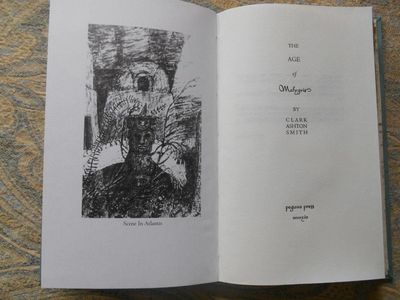
It's a lovely book. It's been a week or so since I read it. I had to collect it on my way to work and wait until the evening to have a proper look at it (I couldn't resist taking a peek in my lunch break). This was all to the good, as when I read the book it was in the golden glow of a late-afternoon sun slanting in at a low angle and showing the grain in the paper.
CAS's stories - these two, certainly - benefit from being given room to "breathe" with generous margins and a fairly large font. The prose poem and "maledictory" (as opposed to valedictory!) poem framing the two stories were new to me and so were the two CAS illustrations. All-in-all it's a very nice book indeed. Thank you for producing it!
--Andrew James
UK
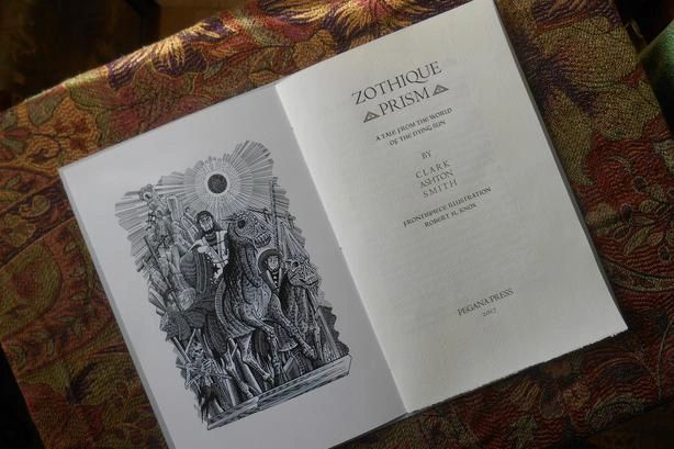
Zothique Prism I SOLD OUT
The Empire of the Necromancers letterpress chapbook illustrated by Robert H. Knox. Pegana Press
A brilliant tale from the world of the Dying Sun by Clark Ashton Smith, The Empire of The Necromancers, presented in a fine press edition chapbook.
Letterpress printed on German Ingres watermarked paper using vintage Goudy and Civilite types and hand sewn onto pale blue-gray French heavy covers with ornate titling. Letterpress cover uniform with Zothique Prism II.
The edition features a newly commissioned frontispiece illustration by Robert H. Knox, famous for his Necromonicon Press editions.
17 pages.
Strictly limited to 55 Hand numbered copies. SOLD OUT.
The Empire of the Necromancers. Frontispiece by Robert H. Knox.
Pegana Press 2017
Chapbook $125.00
Frontispiece by Robert H. Knox
Artist, best known for Necronomicon Press, Crypt of Cthulhu, Hippocampus Press, et al.. Specialties are Dark Fantasy/Horror and humor. Ink, oil, acrylic and sculpture are my media of choice.
Semi-serious musician, currently at work on secret CD projects.
Audio/video maniac with a large, unwieldy collection.