Creating rare, handcrafted letterpress books at Pegana Press since 2009.
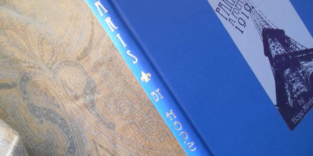
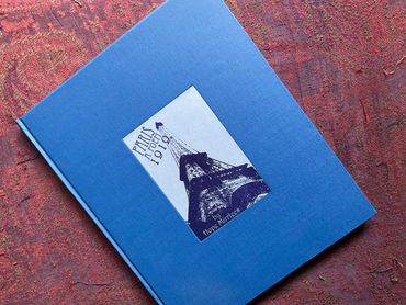
Paris A Poem
By Hope Mirrlees
From the author of the classic fantasy "Lud-In-The Mist", comes this remarkable glimpse of Paris, The City of Light.
The center of bright art and dark vice in Europe of 1919 flows with people of many races and beliefs. Mirrlees becomes our eyes and ears for a journey through the metropolis and its inhabitants, past and present.
Of the XIIIth Duchess of Alba
Long long as the Eiffel Tower
Fathoms deep in haschich...
The Seine, old egotist, meanders imperturbably towards the sea,
Ruminating on weeds and rain...
If through his sluggish watery sleep come dreams
They are the blue ghosts of king-fishers.
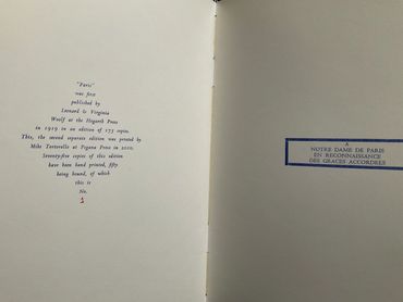
This neglected masterpiece released in 1919 by Virginia Woolf at Hogarth Press in a small edition now selling for $12,000 is available in a very limited press run hand duplicating the original unique typographic design; letterpress printed on French watercolour paper and hand bound by Ars Obscura; using hot stamped gold spine and hand inked inset pastedown of the Eiffel Tower. With a new afterword and gallery of Parisian images. Click the photographs to enlarge.
1 COPY LEFT.
Strictly limited to 50 numbered copies.
Paris A Poem Pegana Press 2010
Paris A Poem $2495
Photo Gallery
Enthusiasm for Paris
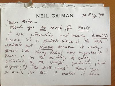
Neil Gaiman on his copy of Paris-A Poem. Published by Pegana Press
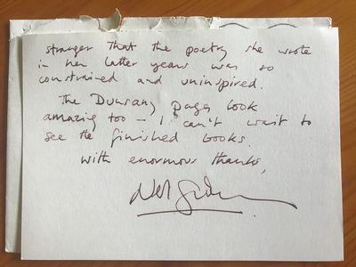
Dear Mike—
Thank you so much for Paris it was astonishing and moving. Astonishing because it’s a glorious piece of the book maker’s art. Moving because it really threw into sharp relief how important Paris is in the history of poetry—published by the Woolfes, predating (and inspiring?) “The Waste Land” Thank you so much for this. It makes it even stranger that the poetry she wrote in her later years was so constrained and uninspired.
The Dunsany pages look amazing too — I can’t wait to see the finished books.
With enormous thanks,
Neil Gaiman
Designing Paris
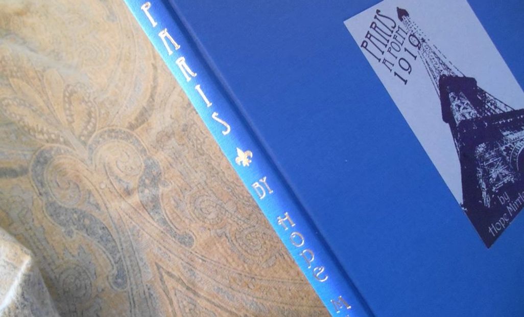
Paris, A Poem by Hope Mirrlees
was the first book printed at Pegana Press. and it was released in 2010, well before I became involved as the binder and general dogsbody for the press. I wanted to find out more about those early days back when Mike was still working a day job and setting type in the middle of the night, and to hear what went into the making of Paris.
The following post is a discussion between Mike and Rita and is presented as an interview...
Let's talk a little bit about this first book project. Why did you choose this particular work?
I was intrigued by the fact that Lud-in-the Mist, considered to be a classic work, appeared to be the only fantasy written by Hope Mirrlees, I started looking around to see if she'd written anything similar that I could print and found Erin Kissane's website, Hope Mirrlees on the Web, where she talked extensively about "Paris".
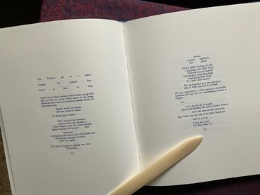
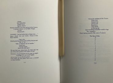
The poem itself was a travelogue of the city within a 24 hour period from sun up to sun up. It is layered with double meanings and puzzles intentionally written into it, reinforced visually by the typography. The poem touches on the history and nuances of Paris, current politics and religion, and the exotic life of the City of Light. Capturing its essence captivated me as well.
"Paris" had become a forgotten work and hadn't been reprinted in its original form since 1919, so I felt that it was a worthy work to print and share with the world. The work itself is so complex and beautiful in its use of language to describe the city of Paris in a slice of Time. "Paris" was also the the first to absorb and reflect French Modernism literature and had a profound influence on the English poets like T.S Eliot and Ezra Pound, shaping Western Modernist literature as we know it. So it also had an historical relevance that I felt should be captured on paper.
Why didn't Paris remain in print?
Paris became an inspiration to modernist poetry, but through her own preference she chose to suppress it. Michael Swanwick covers her personal life and her motives in his book Hope-In-The-Mist The Extraordinary Career and Mysterious Life of Hope Mirrlees available from Temporary Culture 2009.
Can you say a little about the printing process?
I copied the typography exactly, working from a scan of the original I found on Erin's website. This book is so rare, that it's difficult to find a copy anywhere, unless you know which collection it resides in. There were also detailed instructions written by Hope for the typesetting of this book. She really had a vision of what she wanted to convey through the typography.
I know you always put a lot of thought into choosing elements like paper, type, and ink...
I tried to match the original typeface from the scan. I matched it as closely as possible and cataloged what I would need. Italics, bold, different sizes and French diacritics. I spent a lot of time finding the right font to reproduce it as close to the original as possible because of the historical importance of the typography. Hope and Virginia spent a long time working on the typography and I tried to replicate that knowing how important it was to be visually laid out correctly to Hope's specifications.
I wanted to use a French paper and chose an art paper because it's an art poem. The paper I chose is normally used for watercolor painting, but I chose the paper by how it felt. It was a "feel" thing with the paper.
The ink I used is blue because the flag for the city of Paris is predominantly Blue and Red, and the blue seemed appropriate.
I want to ask you about the design you chose for this book. Although you replicated the original typography, you weren't going for an exact copy of the original put out by Virginia and Leonard Woolf at the Hogarth Press. The exterior of this book is different from the original and you also chose to add a section in the back of the book with images. Can you talk about that?
The text is very visual. The typography is a visual of what she was writing about. She even made notes of how the signs looked to her and then had it set that way at Hogarth. It was like a word version of a vacation travelogue. I had a vision of an old travel journal. Blue is one of the two dominant colors in the Paris flag, so I chose to continue with the blue as the cover.
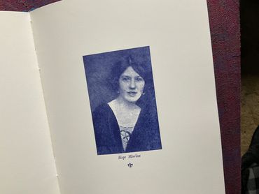
Hope's notes make it a scholarly book and the images seemed to support that. I included the notes and some images from Paris in that era to continue the travelogue feel. I had Owosso Graphics make laser etched magnesium plates for each image and then they were letterpress printed using the same blue ink I used for the text.
Recently someone on Instagram tagged our Paris as cyanotype, because of the blue images. That's a different process, but they do kind of resemble that look.
I imagine between the attention to replicating the type, and setting it meticulously by hand, this book took longer than most to print. Can you remember how long it took you to print the whole thing?
I think it took me about a year and a half to finish. I really came to appreciate this work through the process of setting the type for it.
Reviews
Hope Mirrlees on the Web
Her work, life, and historical context.
This site contains scholarly information about Hope Mirrlees.
Michael Swanwick Ebook
Hope-In-The-Mist: The Extraordinary Career and Mysterious Life of Hope Mirrlees by Michael Swanwick is available as an Ebook through Weightless Books.